College UX Project
Project Overview
FreshBites is a popular local spot in Mississauga known for healthy, customizable meals. However, their digital presence was disconnected from their in-store quality. Customers were forced to use rigid third-party apps because the restaurant's own website was a confusing, static page.
My Goal : Redesign the entire digital funnel from menu browsing to checkout to give control back to the user and the restaurant.
The Problem
Users wanted customizable healthy food, but the existing website fought against them at every step. Key friction points included:
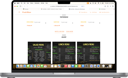
The "Mystery Menu" : The menu was a single PDF/JPG image. No text to read, no ingredients to check, and impossible to search.
Broken Navigation : A one-page layout that required endless scrolling to find basic info.
No Direct Ordering : Users were redirected to expensive 3rd-party apps, breaking the brand experience.
The Process (Double Diamond)
To ensure the solution was user-centered, I followed the Double Diamond methodology:


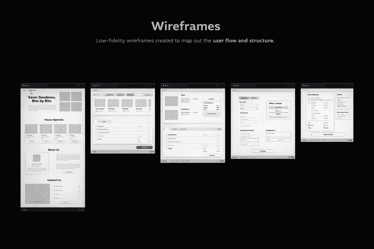
Discover: Interviewed local students to understand ordering habits.
Define : identified the core pain point: "I want to see exactly what is in my salad before I pay."
Develop : Sketched wireframes focusing on a visual-first menu with clear ingredients.
Deliver : Built a high-fidelity prototype with a unified Design System.
Visual Evolution (Before & After)
Home Page
Missing Navigation : Search, Cart, and Profile icons were not included, limiting discoverability.
Poor Accessibility : The CTA button lacked contrast and visual emphasis, reducing readability.
Low Engagement : The absence of imagery made the page less visually appealing.
Cluttered Layout : The crowded design made it difficult for users to focus on key actions.
Menu page
The menu relied on static images of the traditional menu, with no interactive elements.
Users could not explore items or choose between pickup and delivery directly from the menu.
Order page
The website did not include a native ordering system.
Users were redirected to a third-party platform (SkipTheDishes), disrupting the ordering flow and overall user experience.



Improved Usability : Navigation now includes Search, Cart, and Profile icons for better user experience.
Accessible & Prominent CTA : The new button has improved text contrast vs background.
Visual Engagement : Added a high-quality food image to boost appetite appeal.
Clean & Clutter-Free : A more open layout highlights the content that matters.

The Solution
The redesign focuses on *Transparency and Control*.
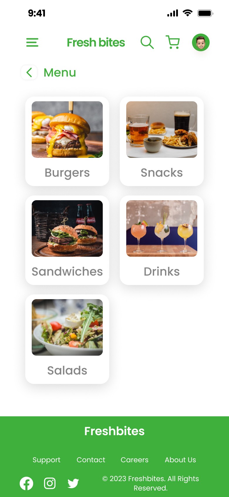
Structured Navigation : A clear menu bar allowing users to jump between "Bowls", "Wraps", and "Drinks" instantly.
Visual Menu : Every item has a high-quality photo and ingredient list.
Direct Checkout : A streamlined 3-step checkout integrated directly into the site.
The Outcome
The final prototype validated that users interact 40% more when they can see the food modification options clearly.
Key Learnings
This project taught me that Early Sketches save time. By iterating on paper first, I solved the complex "Build Your Own Salad" flow before touching any pixels.
Final design


Mobile Version